You’ve created an awesome piece of software, which you have been working on for months. You’ve refined every aspect of it; the aesthetic qualities, the data model, the user interface and experience.
But now you need people to buy it. You release a demo version of your software which allows your potential customers to get a feel for the app and decide whether it’s right for them, or not. And in doing so, you screw up the entire thing.
Where demos suck
It amazes me how many software companies get demo versions of their applications wrong. Demos aren’t a trial period for you of your users, but rather a trial period for your users of you and your software. And if you want to sell your app, you’d better make a good impression.
But time and time again, demo versions of applications aren’t done properly, and rather provide more friction for making sales than acting as a way of convincing your users that your software is worth them buying. Common areas where application demos fall down are:
- You have to register an account to download the demo.
- The emphasis is placed on purchasing the app rather than downloading it.
- The demo places a crippling restriction on the software that doesn’t let you get a proper feel for it. For example, restricting major features.
- There is a time limit on the demo which pressures users into purchasing the full version.
- An annoying window prompting you to buy the app is displayed at frequent intervals.
All of these elements create a negative experience of you and your software, right from the very start. But what is it about some of these irritations that make such demos a bad experience for your users, and what are the alternatives?
1. Account registration
Everyone hates account registration. I – like most other people – already have too many online accounts, and to be quite honest, I don’t want any more.
But where this is even more of a problem for people who want to try out your apps before they buy is that you’re already putting rope around their neck. They may just want to try out your app but you are already asking them to make a partial commitment by signing up to try out the demo.
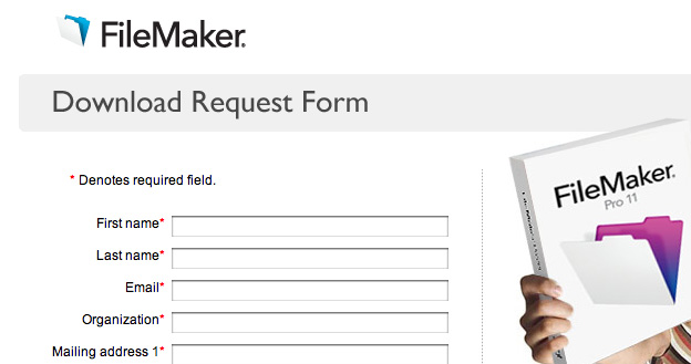
An example of this is with the FileMaker Pro trial download. Before you get a copy of the software to try out, you have to fill in a form, providing your name, address, operating system, and other market research questions such as how you heard about the product. This will be a huge turnoff for any potential customers because they will be less inclined to go through this entire process, just to see whether the application is something they’re interested in or not.
The solution to this problem is simple: don’t do it. On the main page for your app, place a prominent “Download” link which allows people to download your demo in one-click, no strings attached. This way they can see whether your software is relevant to them, without them feeling as if they’re being tied to anything.
2. Emphasis on buy, not try
Another problem with demo software is that the emphasis of the product is immediately placed on buying the software, not offering users to try it first. This ties in with making the users register to download the demo version first, or nagging for them to hand over their credit card details and is again, annoying because it ties them down and makes them feel that they are making a commitment rather than just trying out the software in their own time.
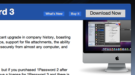
A good example of this being done well is on the Agile Web Solutions downloads page; it is clear that the focus of the section is downloading a demo version of the software to try out first, and not immediately placed on buying it, as shown by the prominence and alternate colour of the “Download Now” button compared to the “Buy It” button.
3. Crippling restrictions
Of course, some form of restriction needs to be placed on your demo applications so that people who have a genuine need or interest for your app can’t use it forever for free.
However, these crippling kinds of restrictions include things like restricting major features from the demo version, which is often counter-productive, because it doesn’t actually let your users see whether your software is right for them, since they don’t have access to certain features, which might be the main reason that they would be interested in using the full version.
Instead of imposing restrictions such as this on your demos, where possible it is better to provide some other restriction that allows your users to get a feel for the application, but perhaps provides an upper bound on their use of it. A good example of this is with LittleSnapper, which limits the number of images in your library in the demo version to 30, but so long as you have 30 or less images in your library you get access to all the other features available in the full version of the app.
From a business perspective, you want to make sure that the restriction you place means that people who are genuinely interested in using your software can’t do so forever without paying, but which doesn’t provide a barrier for those who aren’t yet sure to see whether the app is right for them.
4. Time restrictions
This is probably one of my main annoyances with demo applications – where time limits are imposed on the use of the demo. The reason I find this such a turnoff is that it it similar to being sold something by a salesman on commission: there is constant pressure on you to purchase the full version rather than doing it in your own time.
Again, this seems attractive from the business side of software, and sometimes this may be appropriate, as there is no other justifiable alternative as a restriction on the demo, but this should only be used as a last resort.
And as Matt Gemmell suggested on one of the World According to Gemmell segments on the MDN show, if you are going to impose a time limit as a restriction, make sure that the time limit only applies to the days that the software is actually used. For example, if you impose a 30-day time limit and the user first uses the demo on the 1st of the month, but doesn’t use it on the 2nd, 3rd or 4th and comes back and uses it on the 5th, only count that as 2 days of use, not 5.
5. Prompts to buy
This is probably my biggest annoyance of application demos: where they constantly nag you to purchase the full copy; be that on launch, on exit, or even just during use of the application, it’s a definite no and will not get me – and most other people, I imagine – on your good side.
As I mentioned earlier, application demos are a way for your users to decide whether your software is right for them, and whether it is worth their time (and money). But this is another really annoying feature of demos because it is again pressuring users to purchase your software, rather than letting them decide first whether it is right for them or not.
In this process, it provides your users with a negative experience, and pushes them in the opposite direction to buying your software.
Final word
Application demos are a way for the user to decide whether your software is right for them. It’s your one shot to impress them and convince them that your software is worth investing their time – in learning how to use the software – and money.
Although it might seem like a convenient excuse to offload a whole load of marketing onto your potential customers and pressuring them to make a purchase, this reflects badly on you, and if you offer multiple products they are unlikely to try out others if you create a bad first impression.
The key is to provide a user-friendly experience which portrays you and your software in a positive light; if the software is presented in this enticing manner and people have a genuine need or interest in your software then you are going to make some sales.


Comments — 6
Mar 13, 2010
Re point 5: In my experience a “nagging popup” will make me even more likely turn away from an application *even though* the application handles the job better than another one. But simply the fact the app annoys me while testing it, makes me search for alternatives.
Mar 14, 2010
Hehe, I remember seeing that FileMaker page when wanting to see how the app developed in the past decade. And it instantly convinced me to stick with the ancient FM 6 I still have sitting around – or go and download a demo + s/n from Bit Torrent which would seem more convenient.
I am not so sure about nagging. While I am annoyed by it and consider nagging bad taste, I also know that I just tend to forget to buy stuff which I’m OK to pay for unless it reminds me in a sufficiently clear and frequent way. So how can people push me to do the right thing without looking bad? I think if those reminders are well done and provide a straightforward (one click?) way to buying the app with instant gratification, they can be quite useful.
Mar 14, 2010
Yes I see your point and I imagine they can sometimes be useful; a good example of doing it well is with the free version of Tweetie; if you go into the preferences and uncheck the “Show ads” checkbox it prompts you to purchase the full version (which removes them) in a way that isn’t irritating and can easily dismissed if you want to continue using it for free.
Although of course it is a fine balance between not being too intrusive but also making sure that people who are genuinely interested and have a use for the software actually purchase it.
Oct 19, 2010
In my early programing days, I always limited my applications to uses, so I’d give users 10 “runs” of the software where they could run it without limitations plus I’ve done demos – but frankly, they suck.
A 15 day trial with a kind reminder at startup telling people how many days they have left in the trial, which as SSP said, reminds them in a sufficiently clear way.
Oct 19, 2010
True, although I think it makes sense if the days counted are only days on which you *use* the app.
Oct 26, 2010
The system I will adopt in USB Backup is a friendly reminder on the last day of the trial only and no reminders before that. Easy and doesn’t bug people.
Add comment