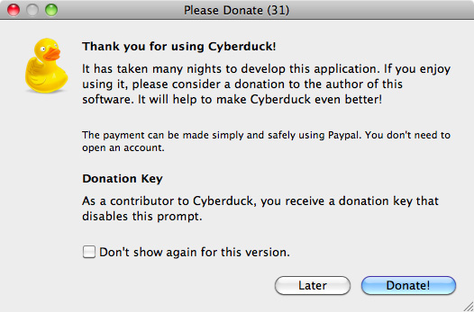
The other day I was using Cyberduck more heavily than I would usually, when I was doing a whole load of uploading. When I came to close the application, I was presented with this dialog:
It’s a fair enough dialog, I have been using free software which someone put their own time into and I’m appreciative, and might think of donating to the developer(s) who wrote it.
However, two fatal mistakes have been made here:
From a business or financial perspective, that sounds brilliant. Prompt the user to give you money every time they close your app, because they’re probably going to forget to check the “don’t show again” box, and fortunately for you, if they happen to accidentally hit enter then they’re going to be taken straight to the donate page.
But in terms of establishing goodwill with your customers, it’s a horrible decision – the dialog is annoying, and this is only going to be a lingering annoyance if you repeatedly forget to check the “don’t show again” option – something fairly likely since it’s on application terminate when you generally want or need to get out of the application quickly.
You should always make sure that options such as this are safe and off by default – that is, that without any user intervention if they are prompted once for something that is an extra and something annoying, the option to turn it off is set to yes by default. By default, no stupid emails when registering for an online account, no annoying popup boxes or dialogs.
Be subtle
Of course it’s reasonable to have some form of link to donate to a product, or buy a full version or something similar. But if you’re going to have one be subtle about it. Put it in the about box or discreetly as a menu item, so that if users want to find out more they can do, but it’s not always glaring and in-your-face. I quite like how Viewfinder by Connected Flow does this on their demo version:
Granted it’s always there, but it’s a discreet message and in a small font, which isn’t particularly distracting and at the least doesn’t get in the user’s way.
Overall a winner
At the end of the day, if your app isn’t annoying and persistent about money, the good experience you give your customers will make them more likely to donate to your project. And if your product is commercial then you’ll give your users a better experience and mean that others are likely to purchase it based on the good things that people say about it.


Comments — 4
Dec 21, 2009
I wonder if anyone has done A/B testing to find out which method actually performs better. Of course, that would be a good way to measure and compare dollars donated, but it wouldn’t capture the good will generated by the more subtle reminder.
Dec 21, 2009
That would be an interesting idea – I think the better the user experience is, the more goodwill and the more satisfied people you’ll have. And doing things like this which revolve around the user is just one more thing to help in that respect.
There are people who are never going to donate, and those who might donate; and being less annoying is probably going to make those people more likely to do so.
Dec 21, 2009
Good post, you need the thumbs up/down thingy again 😀 Felt it was missing from this post.
Dec 21, 2009
Yeah I was going to do that – I just need to sort the plugins out.
Add comment