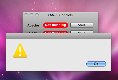
When firing up Apache the other day, XAMPP presented me with the ever helpful error message:
Taking a step back, Wikipedia describes error messages as:
a message displayed when an unexpected condition occurs, usually on a computer or other device. Error messages are often displayed using dialog boxes. Error messages are used when user intervention is required, indicate that a desired operation has failed, or give very important warnings such as being out of hard disk space. Error messages are pervasive throughout computing and are part of every operating system or computer hardware device. Proper design of error messages is an important topic in usability and other fields of human-computer interaction.
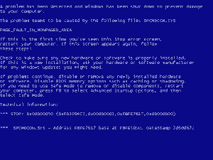
This last sentence is where almost every error message in existence falls down. Of course, we all know the infamous Blue Screen of Death:
and I admit that some like it more than others, but in terms of usability and end-user communication, it is a complete failure.
There are several types of error messages that exist:
- The technical: This error message is purely about the technical fault, and disregards the “average” user completely. This is the category that the BSoD would fall under. It offers little assistance to the user about what actually went wrong, and moreover, little or nothing on how to fix the problem.
- The ill-informed: This type of error message often “babies” the problem to such an extent that the error message is no longer at all useful to anyone (be that a developer of the software or the end user) or doesn’t explain the error in sufficient detail. This type of error message may simply ask to “refresh the page” or “come back later if the problem persists”. Although this type of error message can sometimes be unavoidable, for example in instances where the application does not know what went wrong, perhaps due to an abstraction, this is best avoided.
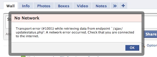
- The hybrid: This type of error message loosely ties the previous two types of error message together. It provides some technical details about what went wrong (to those who understand the technicalities) as well as some user-friendly information to the “average” user. Facebook implements something similar to this in some of their error messages:
 It provides a bit of technical information to pinpoint the exact location where the error occurred, whilst providing a (fairly) friendly error message to detail that a network error occurred, with a brief point on how one might go about trying to fix this error.
An error message should:
- Be contextual, pinpointing exactly what occurred and not generic; instead of saying “file not found”, what file could not be found?
- Not be overly technical; an overly technical error message just confuses the user and doesn’t help them to understand what went wrong; providing technical information can be good, especially if it is something to be taken up on a support page, but writing the message so that it is incomprehensible to any users defeats the purpose.
- Give some guidelines on how the error can be fixed. This may not be concrete, since some errors (especially those involving networks) are partial to the application, but should at lest provide some points that the user could try out to help fix what went wrong.
- Only use error codes if they are explained. Error codes should be internal to the application and not simply plastered into a dialog box as a number which means nothing to the user. If they are used as a reference point to a support page, make sure they are explained contextually (relating back to point #1).
Error messages should be there to provide enough technical assistance to help the user diagnose and (preferably) fix the problem, but presented in a clear manner that the end-user can understand.


No comments
Add comment