Users don’t like change. Perhaps one of the most apt demonstrations of this is with Facebook. Only today, changes were made to Facebook, basically consisting of a new setting on the front page:

Which can be changed to:
(Dependent on your level of stalkiness).
Being a moody teenager myself, I am, naturally in contact with.. A lot of moody teenagers. And there has been almost outrage over the new changes; groups with such titles as “i HATE THE NEW FACEBOOK!” rallying troops with motivational speeches including “i HATE HOW FACEBOOK HAS BECOME MORE CONFUSiNG, THEY ARE ADDiNG TOO MANY FEATUrES, PEOPLe CAN SEE YOUR EVERYMOVE…NOT A GOOD LOOK!!!!” have sprung up thick and fast (you’d perhaps be misguided that International Caps Lock Day is infact the twenty-third of October).
Although I find this very amusing, I can sympathise.
Of course changes have to be made to Facebook, otherwise it would remain like a stagnant pool for 10 years. And I’m sure they’re responding to user feedback and I’m sure in the long run it will improve the whole Facebook experience (although this particular update seems like a bit of candy to satisfy the kids).
But the way they’ve gone about it is terrible.
What is this? What can it do for me? Why the hell would I even want this?
were several questions that came through my mind, and where were the answers? Where was the explanation of how or why to use this? Nowhere. Users have basically been thrown into the deep end – accustomed to the “old” Facebook layout, this change has been sprung upon the site, and they don’t know what to do with it, how it works (initially) or why they would want to use this.
And this is not new. This has occurred several times with Facebook.
Joel Spolsky summarised this quite well on Episode #51 of the Stack Overflow podcast:
Spolsky: They’re gonna start, I mean, every time I changed a font, I could change a font on “Joel on Software” and get, you know, 30 angry emails, and then change it back and get another 30 angry emails, 25 of them from the same people that were upset the first time I changed them “ I just finally got used to that font that you changed”. And have to change it all over again.
And it’s because people don’t like to be somewhere they’re uncomfortable. They want to be familiar with their surroundings and know what to do and how to do it.
Not just cainophobia
By now you’ve probably come to the conclusion that users simply don’t like change. But this is an important thing to note. This is why designing UIs which are familiar to users is so important – UIs which reflect their mental model, which are consistent with other applications on the platform, which have workflows which are common and canonical are so important. Because if they aren’t, then you’re throwing your users into the deep end, and their experience will be so much worse.
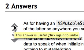
And if it isn’t, make sure that an explanation is near – all you need is a small question mark icon, or a line of text which explains what something is, or perhaps a tooltip, such as those on Stack Overflow:
which will give your users confidence in what they’re doing and help them to do what they want to do.


Comments — 4
Oct 24, 2009
This is so true. I am often amazed at the amount of negative responses sites and software receive due to users not being happy with changes. This is the nature of the beast when dealing with people however can have a positive and negative impact on the site or product if the change is to drastic.
Interestingly, even with all the complaint Facebook receive when making changes, they still have an exceptional growth rate. Therefore it can necessarily be all bad.
Oct 25, 2009
Yes; I guess that is the nature of community, as you say. And I agree, in the long run it is probably a net positive, but I think it’s a great example of how people don’t like change and the way they are so uncomfortable in surroundings that they’re not used to.
Oct 27, 2009
Familiarity and learnability are two tough tasks to accomplish in design. I’d argue the latter is more difficult, especially for large sites like Facebook.
The decisions around Facebook’s constant redesign do not always stem from wanting to improve existing usability, but rather wanting to compete with other services out there(e.g. Twitter).
http://www.8164.org/familiarity-learnability/
Oct 27, 2009
Yes I agree, and Twitter is a great example (see news feed and @-tagging) and I guess I didn’t cover that.
And cheers for the link – nice post.
Add comment