One of my favourite principles of good design is:
You know you’ve achieved perfection in design, Not when you have nothing more to add, But when you have nothing more to take away.
— Antoine De Saint-exupery
I find this especially relevant when there is lots of information to be presented in an interface, to help with deciding which parts need to be displayed, and which bits don’t.
Lists
The list based interface seems to be a popular choice when displaying lots of information; all you have to do is look at sites such as Twitter, Facebook, YouTube, Delicious, Vimeo – or even iPhone apps, where list-based interfaces are pretty much the way to display information – to see that this is true.
Lists work as a way of displaying information for a few reasons:
- They display a set of connected items.
- They can be used to display sorted data, often used when there is a chronology to information.
- They are useful in summarising information which can be quickly and easily scanned through.
Whilst a useful way of displaying lots of information, lists often fall short because of the amount of information that is presented in a small space, which leads to a cluttered interface.
Swamped by Metadata
Think about the actual content which is displayed in a list: statuses, blog entries, bookmarks etc. Most of these have associated metadata and this is often the cause of the problem of information crowding.
Take a Tweet on Twitter (as part of a conversation) for instance:
@alextgordon I’m surprised (but probably shouldn’t be) those are on different code paths
That is the content, but is outweighed by its associated metadata:
- Author username: @rentzsch
- Author real name: rentzsch
- Time posted: 13 hours ago
- In reply to: @alextgordon
- Posted with: Mobile Web
And it also has associated actions:
- Favourite
- Retweet
- Reply
The challenge with listing information effectively lies in deciding which of these bits of information to display. Take the ‘New’ Twitter web UI, for example, which I feel displays far too much unnecessary information. The ‘conversations’ feature (probably inspired by clients such as Tweetie) has made it into the web app but feels too densely packed:
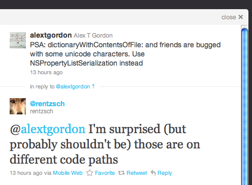
The conversation consists of only 2 tweets, but often Twitter conversations consist of many more. For serving the purpose of displaying an overview of the conversation, a lot of irrelevant information is displayed, such as “in reply to…” and the Favourite, Retweet and Reply actions (which are duplicated from the tweet in the main Twitter feed to the left). Because of all this information although the actual content (the Tweet itself) is only 88 characters and displayed in a larger font, it feels crowded by this metadata, which makes it harder to scan for the relevant information.
Non-web apps such as Tweetie and Echofon have already implemented conversations pretty well in a minimalist way which gets the most important information across and makes it easy to scan through the conversation:
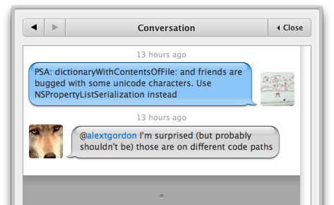
Here the use of speech bubbles indicates that the tweets are connected and are replies to each other, which removes the “in reply to” line that the Twitter web app uses. The names and Twitter usernames have also been removed to further compress the information, and the interface uses avatars instead. The information is much easier to digest because there is lots of space and an absence of unnecessary data.
Nothing more to take away
In order to list information effectively, work out how much of it can be removed whilst still serving its purpose. Is that full timestamp needed? Do the number of comments on that blog entry make sense as a hook for what people want to read? These are all things you need to think about when deciding how to display information in the most effective way possible.
Comments — 2
Oct 15, 2010
“Here the use of speech bubbles indicates that the tweets are connected and are replies to each other.”
I disagree. The speech bubbles don’t link those two tweets at all — all they show is that one of the tweets is from you and the other isn’t. Even then, you could do that without the speech bubbles — they just add prettiness.
The only thing that indicates that the tweets are linked is the big “Conversation” header. Without that, if I didn’t know the first tweet was by @alextgordon there is nothing at *all* in that UI to link the two.
Oct 15, 2010
@Daniel: True, on their own they may not firmly show that they are direct replies to each other.
However, the speech bubble UI is similar to that in iChat or text message conversations on the iPhone for instance, which all in turn probably originate from comics where speech bubbles *do* follow on from each other and are linked, so play at least a part in showing this relationship.
Also conversations in Echofon are only displayed if the members of that conversation are other users that you follow, so it’s likely that you are able to recognise the avatars in most cases.
Add comment